What’s the Secret Behind Addictive Mobile Game Art?
The Psychology of Visual Engagement
Mobile game art is more than just eye candy — it’s a strategic tool that influences how long we play and how often we return. The most addictive games use art that taps into our emotions, instincts, and habits. But what makes certain visuals so hard to look away from?
Part of the answer lies in psychology. Our brains are wired to respond to color, motion, and pattern. Bright palettes can evoke happiness, warm tones build emotional attachment, and cool shades help with focus and clarity. Clever use of contrast and saturation guides the player’s attention, while animations and transitions give a sense of momentum that encourages continued play.
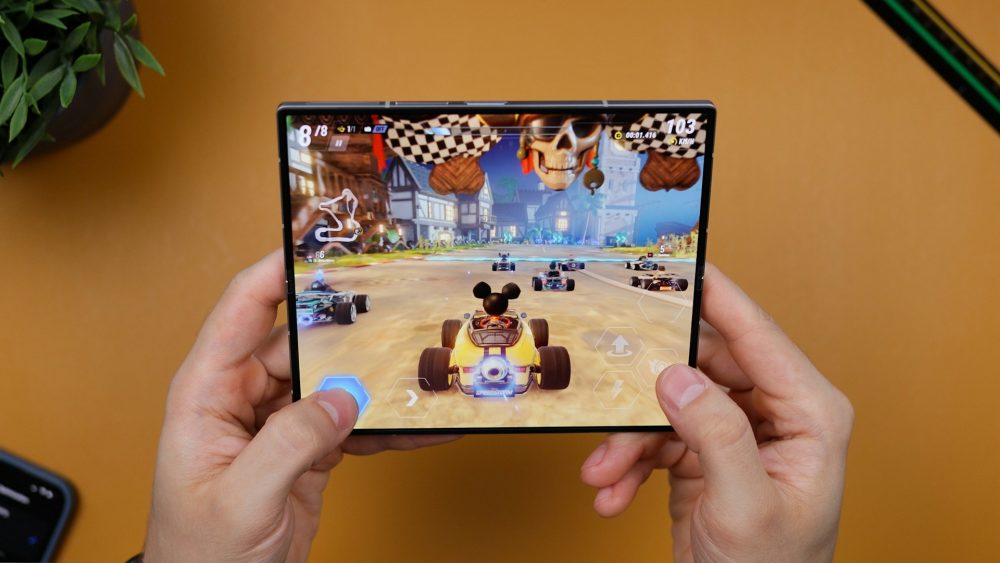
Furthermore, successful mobile games use visual cues to create instant familiarity. Characters with big eyes or exaggerated expressions trigger emotional reactions. Iconic silhouettes, simple shapes, and clean lines help players quickly understand the game world, which is especially important when playing on smaller screens. These design choices reduce the learning curve and increase the likelihood of early engagement — a key factor in retention.
Design Principles That Drive Addiction
Visual addiction isn’t accidental — it’s the result of carefully applied design principles. Games that are visually addictive often rely on consistency, reward feedback, and simplicity. Consistency in art style builds immersion. A character’s design, environment, and UI all need to feel like they belong in the same world. Inconsistent or jarring visuals can disrupt the experience, pulling players out of the game.
Reward feedback is another visual hook. Every level up, item unlock, or milestone should come with a visual payoff — particle effects, vibrant colors, or fun animations. These signals activate the brain’s reward system, making players crave more. It’s the same mechanism that makes social media so addictive: small, satisfying feedback loops.
Lastly, simplicity plays a major role. Mobile screens are small, and attention spans are shorter than ever. Successful games keep their visuals clean and easy to interpret. Cluttered screens or over-designed characters confuse players and reduce their desire to continue. That’s why minimalist art styles are so popular — they offer clarity, focus, and speed.
Key Visual Elements That Capture Attention
- Color Theory: Using harmonious or contrasting colors can set the emotional tone and direct user focus.
- Character Design: Memorable, relatable characters build emotional bonds and brand recognition.
- Motion and Animation: Subtle movement gives life to static elements and keeps the screen dynamic.
- Environment Design: Creating visually rich but navigable backgrounds supports immersion without distraction.
- Feedback Loops: Visual responses to actions (like glowing buttons or confetti on achievement) reinforce player behavior.
One notable example of this strategy in action can be seen on metabulagames.com, where visual design is clearly a priority. Their game art showcases a deep understanding of how visuals support gameplay and emotional impact. Through cohesive color schemes, expressive characters, and engaging UI elements, they demonstrate the importance of art in player retention.

These techniques don’t exist in a vacuum. They are part of the larger framework of game development that includes mechanics, story, and sound. But when the visual component is executed with intent and strategy, it becomes the glue that holds everything together. Players may not consciously notice the art choices being made, but they feel the effect — and it keeps them coming back.
In the end, the secret behind addictive mobile game art isn’t just about drawing pretty pictures. It’s about understanding human behavior, leveraging design principles, and crafting visuals that feel as good to interact with as they do to look at. When done well, the art becomes more than decoration — it becomes an experience in itself.